
Fit inc is hosting a week long discount on all of our services. This means half off everything from one on one coaching to group classes. If you are looking to get into shape this discount event is the perfect starting spot along with that a purchase of any service comes with a free T-shit and water bottle. This is the perfect excuse to get into the gym at a low price and amazing deal this wont last forever so make sure to get in soon!

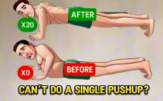
Have you ever wanted to do a pushup? One of our personal trainers has made an instructional video for how to do a pushup with variations to make it easier and harder for you. Its a great place to start if your looking to build some chest and arm strength. In this video you are walked through how to do a pushup with proper form as well as a triceps variation at the end.
Web Design Graphic Guide – I tried to make the website feel professional straight to the point as to not waste potential clients time and set up the viewing top to bottom for convent scrolling. I used the default font for the website as I tried to find how to change them but could not. the colors I used was mostly black and white for a clean sharp look in my opinion. The mood I was trying to set was professional look throughout the website I chose not to use different font colors other then the logo to make it more eye catching and to not take away from the professionalism with different colored fonts. I chose these elements because from what I have viewed online most websites have a sharp and clean look to them adding to the professional look that I tried to imamate. Along with that working outt the wrong way can have serious bad effects on somebody and if you seem unprofessional people might be hesitant to trust you with there body’s health. I think that a website made to gain clients for a business shouldn’t have many different colors or a variety to make it easy to read for anybody despite color blindness and seeing issues. The name I chose was Fit Inc and I made a logo for it early on I chose this name because getting fit is the main goal for many and the clients that would be interested in what my website would offer. I found that using a more plan looking website would add to the logos fun bubbly font and colors making it eye-catching. As for the category I love fitness and am in school to be a personal trainer so it fits with what I am learning and will have to start one day. It was interesting to research for this project and try to understand what would be a good offer and different services a gym could provide.
Reflection – I think that I could have took more time to read the requirements for some of my submitted projects. I also could have looked a bit more at the course notes when I wasn’t sure on how to do something. I finished project 3 but was 5 minutes late to submit it and didn’t get to and could have started the project sooner. My three largest take aways from this course are to take my time and read more carefully. Submit my projects on time and that using online media can be a huge boost for my future career and job, its almost vital to being successful having a online presence along with it being a great way to connect with other like minded people. Identify your 3 largest takeaways from this course & why. Complete the post with a concluding statement about FIT2227.

